Hubspot Social Rebrand
As HubSpot’s social presence scaled, the social team had begun creating graphics independently to keep up with the pace of content demands. While this allowed for speed and experimentation, it resulted in a fragmented visual system. There was limited brand consistency, unclear hierarchy, and no shared design language across posts. The opportunity was to create a flexible yet cohesive social design system that empowered the team to move quickly while ensuring every post felt unmistakably HubSpot.

We began with a full audit of HubSpot’s existing social channels to understand what was working, what was inconsistent, and where the brand was getting lost. Posts varied widely in typography, color usage, layout, and tone, making the feed feel disjointed and difficult to recognize as a single brand experience.
Alongside the internal audit, we analyzed competitor and adjacent brand accounts. This helped us identify patterns in high-performing social content and understand how brands successfully adapt their identity for social platforms. Social media is inherently different from core brand applications. It is more expressive, louder, and allows for rule breaking in a way that still feels intentional.
The key insight was that while HubSpot’s brand could absolutely be more playful and expressive on social, it still needed consistency and structure. Without that foundation, the flexibility became visual noise rather than brand personality.
Setting the Foundation
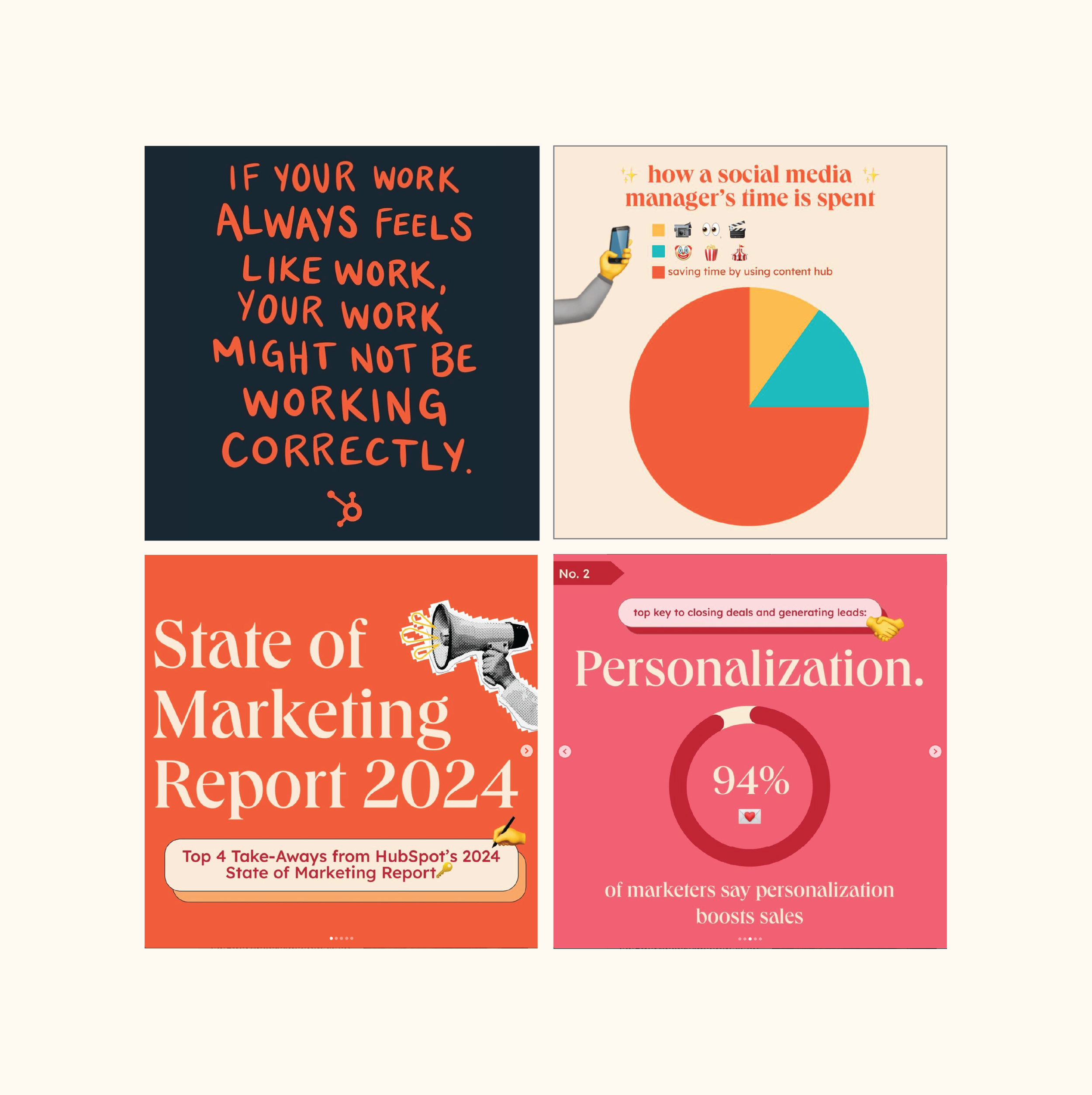
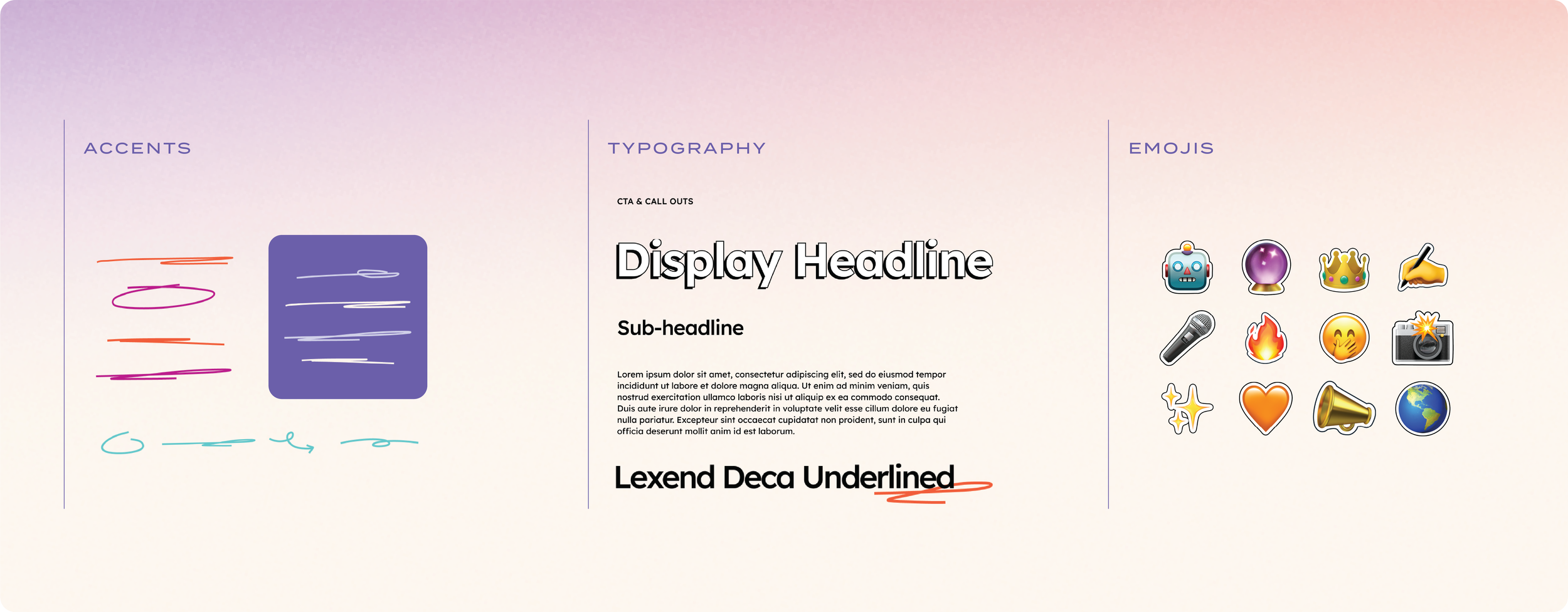
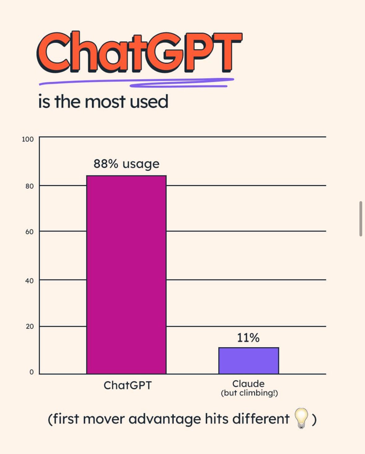
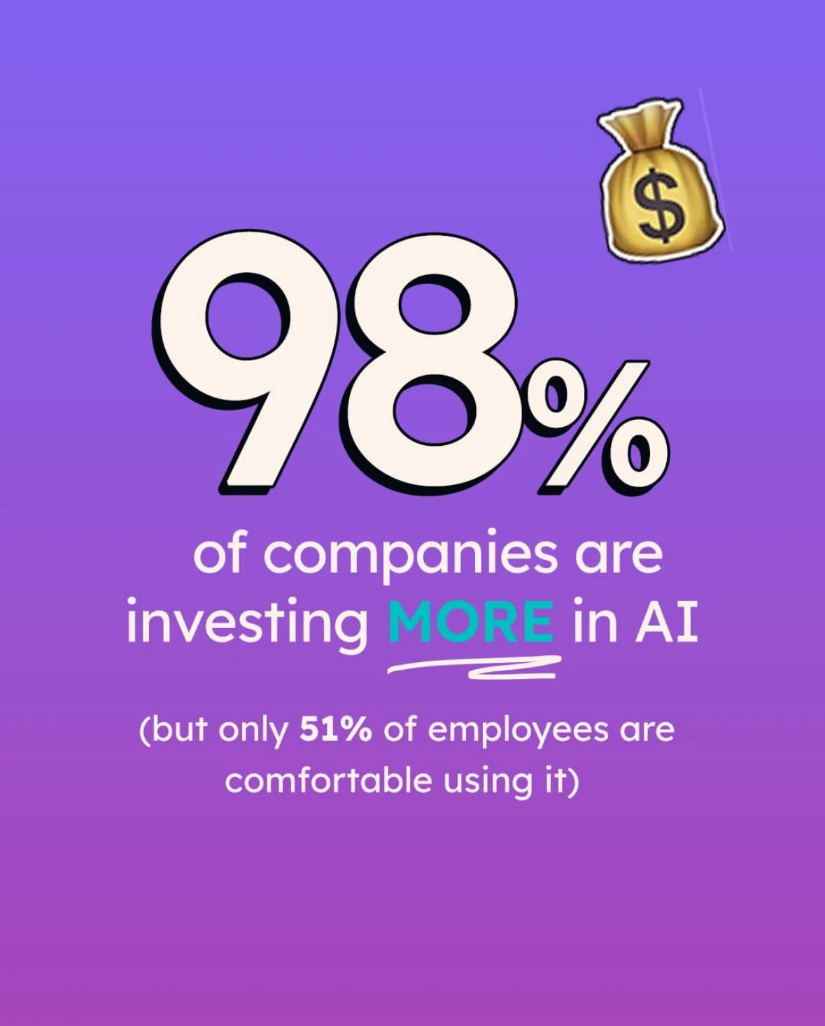
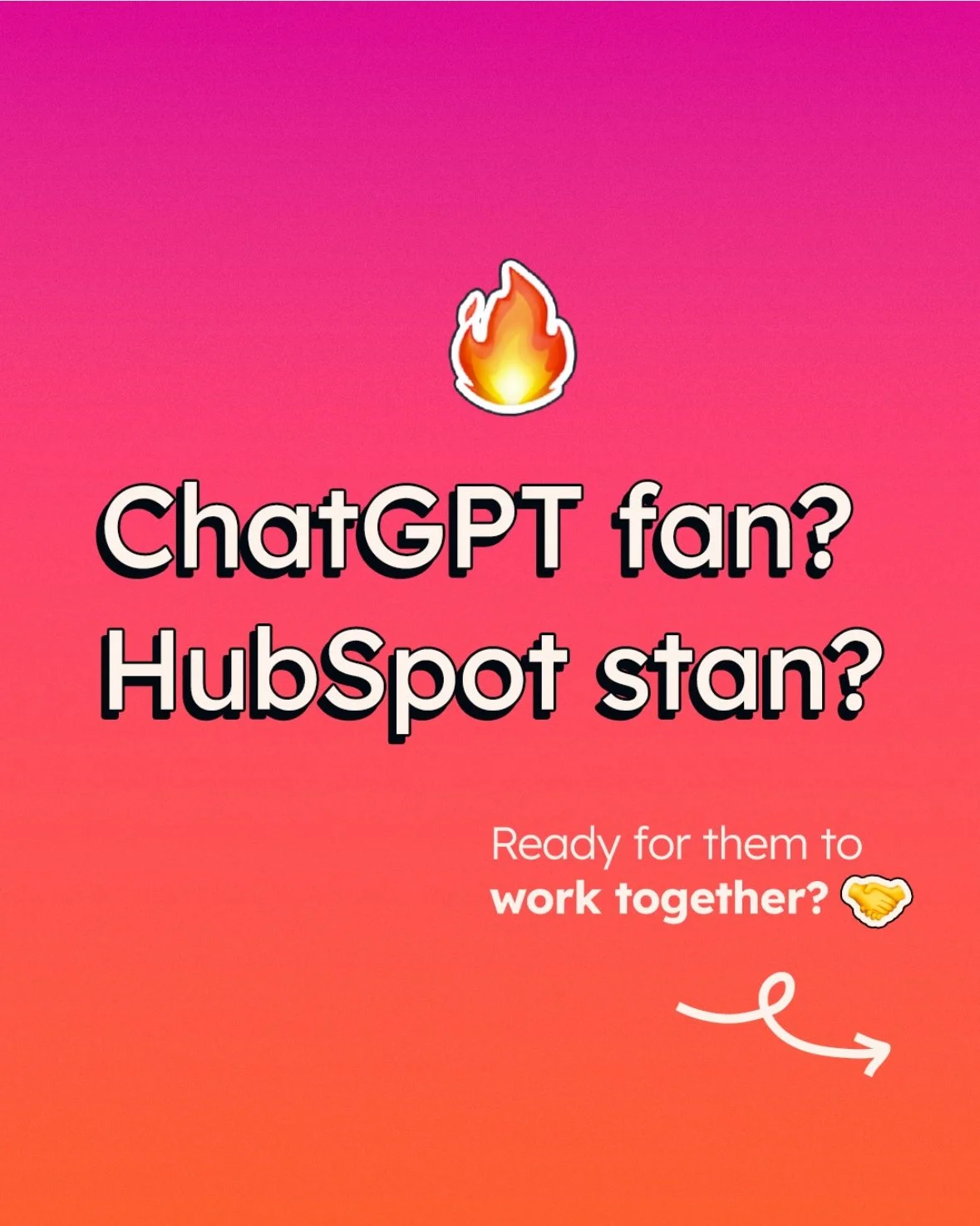
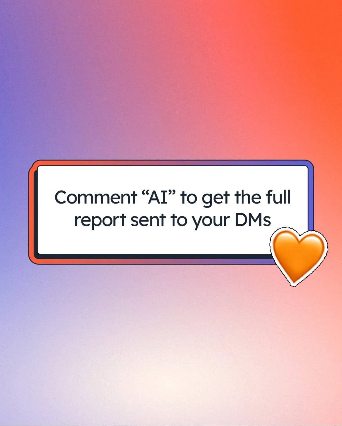
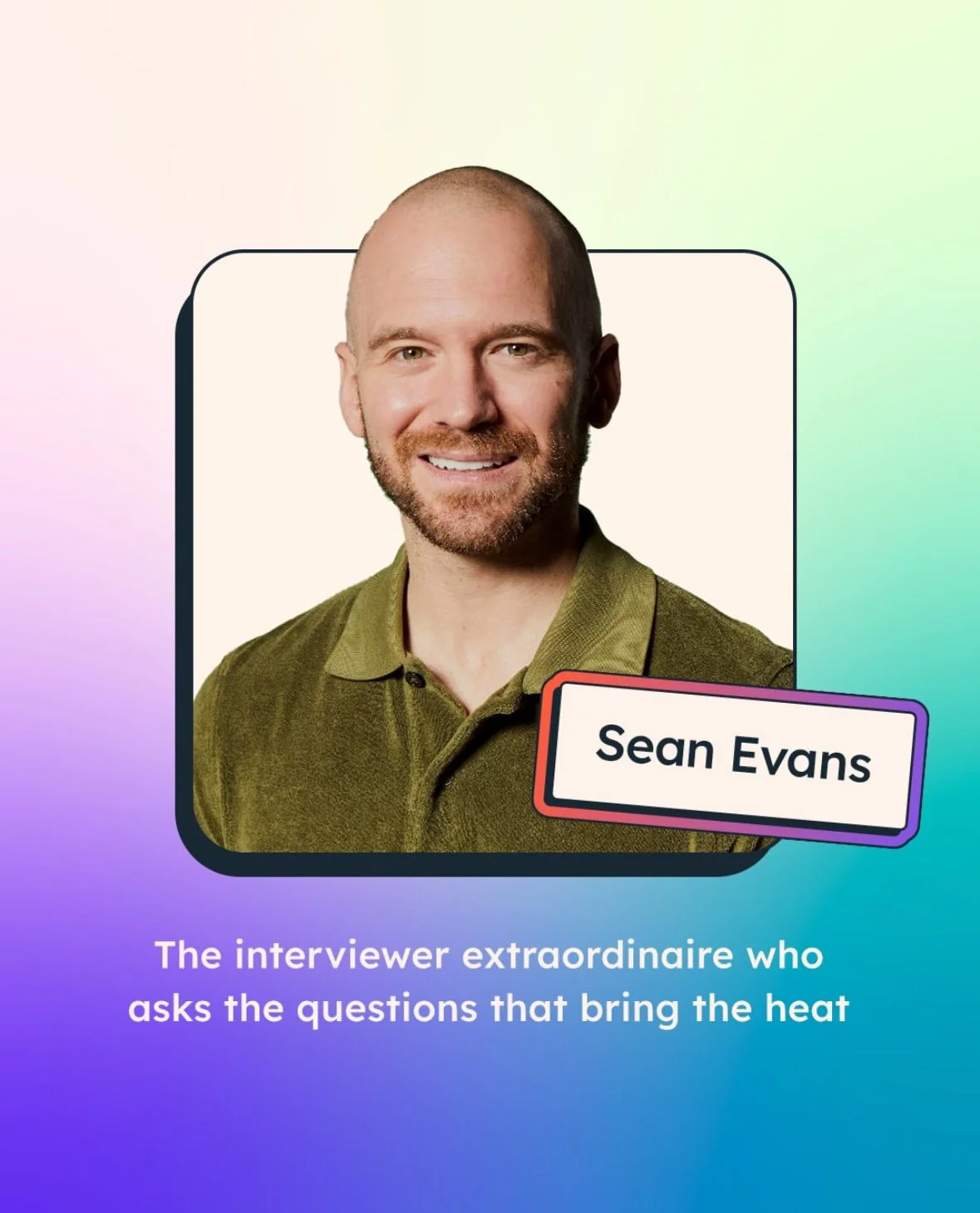
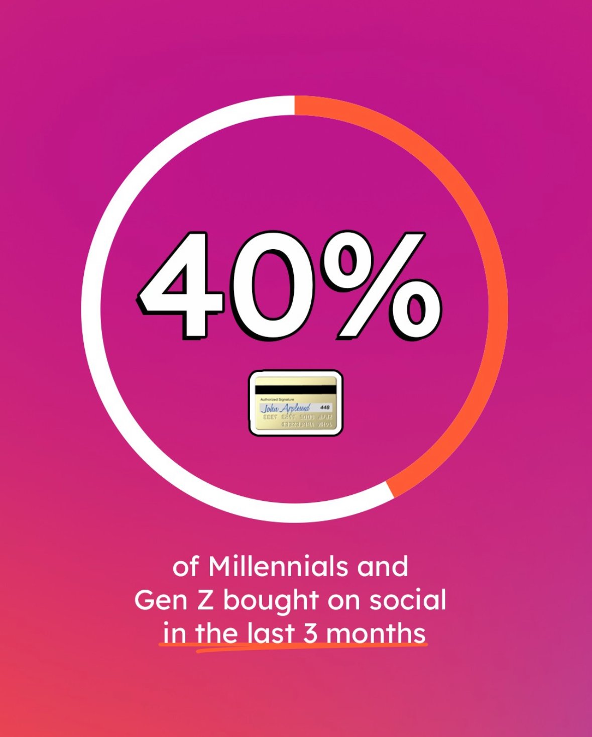
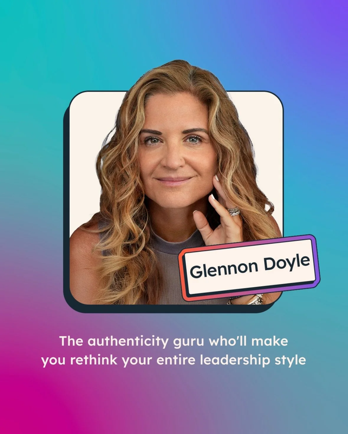
We developed a social-specific design system rooted in HubSpot’s core brand elements but optimized for fast, scroll-stopping content. Bold colors from the existing palette were used more confidently and more frequently, with a clear emphasis on HubSpot Orange to reinforce brand recognition across platforms.
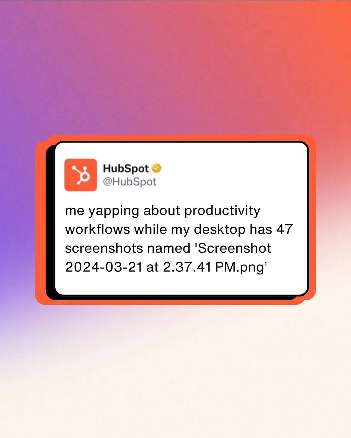
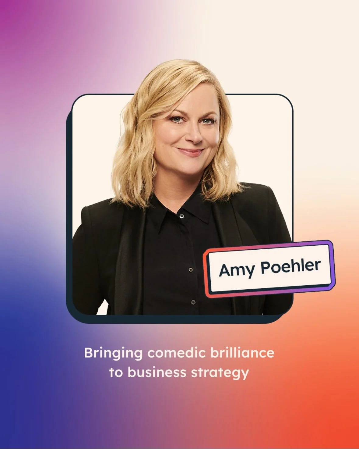
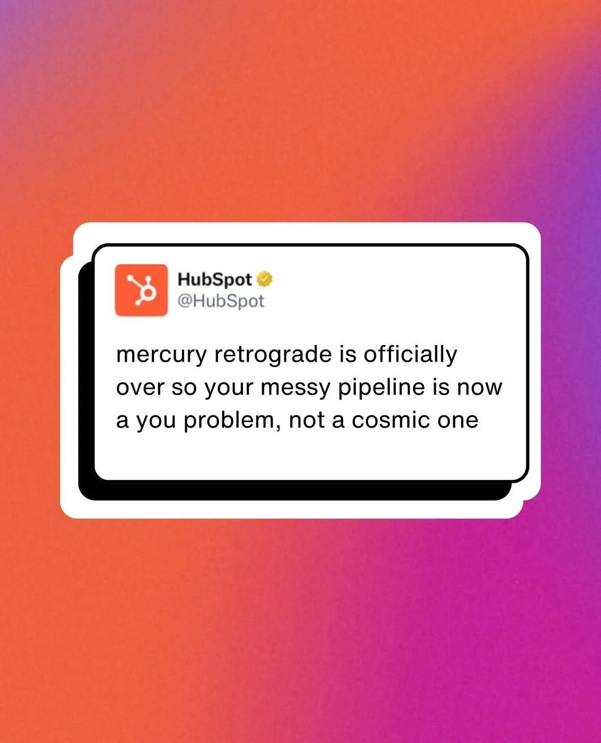
One of the defining elements of HubSpot’s social voice was the team’s love of emojis. Rather than removing them, we elevated them. We created custom, stylized emoji treatments with outlined forms so they felt integrated into the brand system and stood out visually instead of blending into the background. These became a recognizable and ownable asset within the social ecosystem.
To further enhance the playful tone, we introduced hand-drawn embellishments such as underlines and callouts. These elements added personality, guided the viewer’s eye, and provided a flexible way to highlight key messages without overwhelming the layout.


The Impact
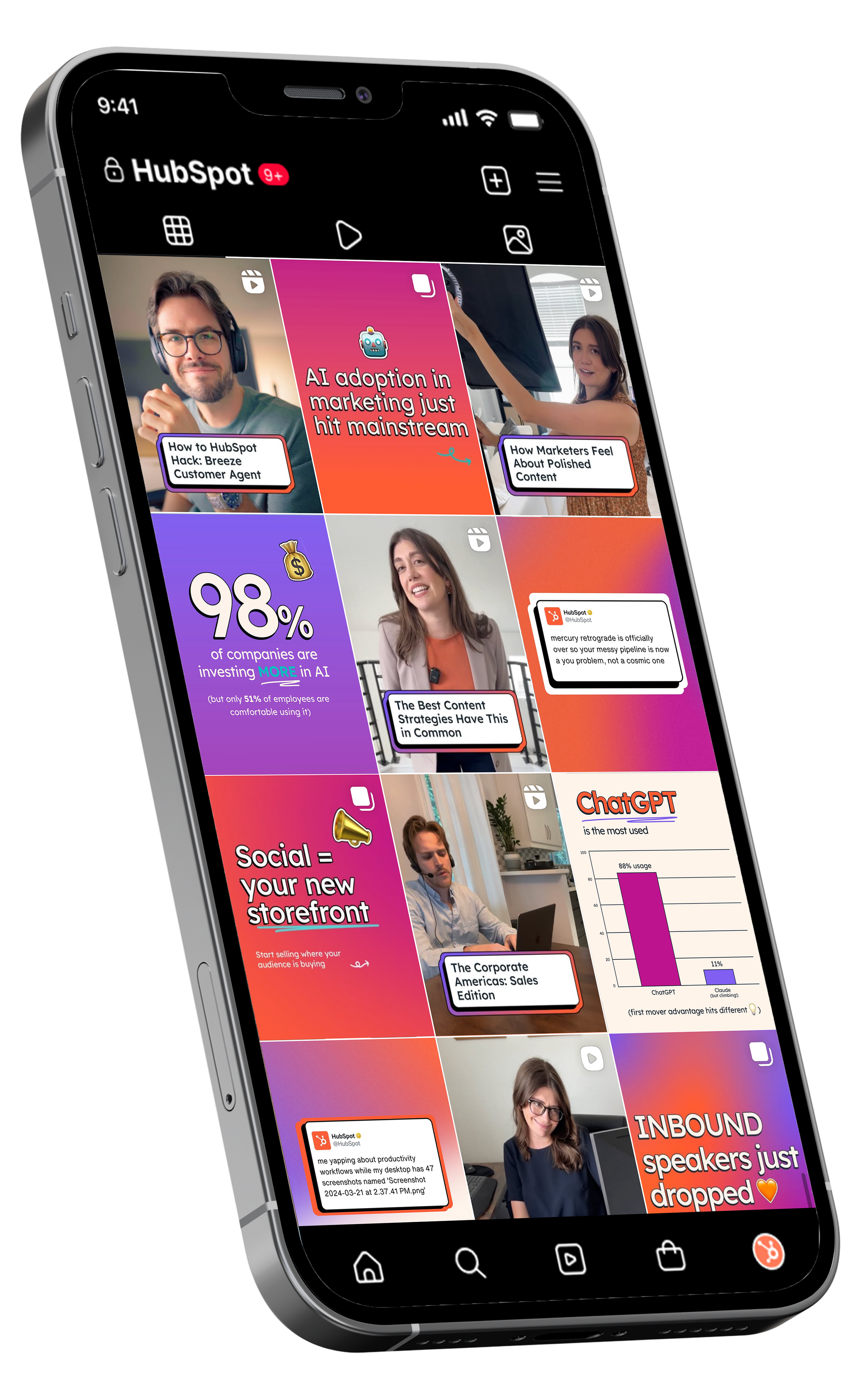
The result was a rich, cohesive social feed that felt energetic, confident, and distinctly HubSpot. The system balanced structure with flexibility, giving the social team tools they could use daily without sacrificing creativity or speed.
Role: Senior Designer, collaborating with Social Media Director and Brand Team
• Instagram engagement increased 35% quarter-over-quarter following launch
• Brand recognition in social audits improved from 62% to 89%
• Social team velocity increased—publishing 40% more content with consistent brand quality
• Created 25+ reusable templates now used across 4 social platforms
• System has supported 1,500+ posts and counting
Timeline: 3-month design sprint